The Power of Cover Art
- Emanuel

- Aug 3, 2019
- 4 min read
Updated: Oct 16, 2020
Cover art has always been essential to any project that’s dropping whether it’s an EP, a double album, or a mixtape passed out by hand. You often hear to “not judge a book by its cover”, which makes sense if you mean to not make generalizations off appearance alone, but in this case for books and albums the cover is there to be judged. Some artists want the cover art to be synonymous with the sound the project conveys. A basic example of that would be “FM!” by Vince Staples
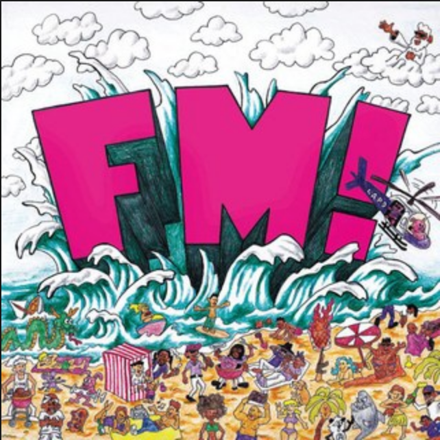
where the cover is a cartoon drawing of a beach and the title appears in a simple and loud design that takes up most of the space. The album is short and concise; the sound of the project is very clearly made for the summer. His previous project “Big Fish Theory” is just a close up photograph of a goldfish, and the sound is experimental and uses the ocean as a theme for multiple songs.
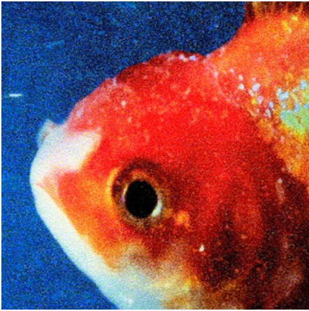
If the cover art had nothing to do with this sound it arguably wouldn’t have made a difference, but because the erratic photograph matches with the erratic sound it sticks in your head more. It isn’t one of my favorite albums but when I see similar imagery I think about it and sometimes give it a listen. That’s a solid reason as an artist to put a lot of effort into your cover art, a basic cover art doesn’t have bad consequences but a great one can expand your influence on current and potential fans. It’s a simple choice that can make no difference at all or make you iconic. Rap cover arts in general have come a long way. From an objective standpoint Vince Staples’ cover arts seem to follow a more indie convention over anything. Classic rap cover arts were usually a posse flick (see Puff Daddy’s “No Way Out”),
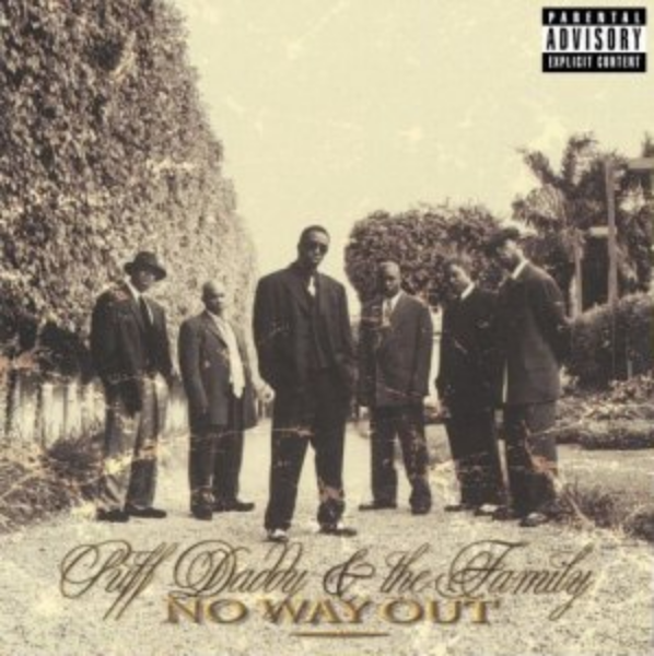
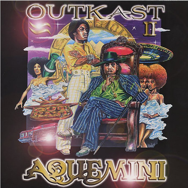
a drawing of the artist (see Outkast’s “ Aquemini ”), or the classic mixtape format perfected by No Limit Records and still used to this day; a photo-shopped rapper on a background with obnoxiously large iced out font and a background full of flexed-up imagery.
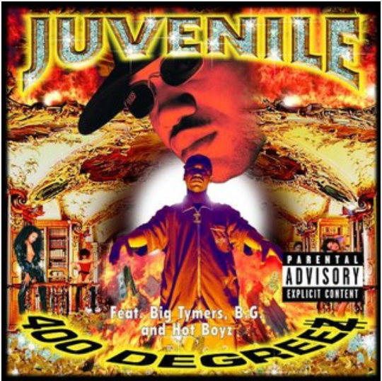
Just take a look at the classic “400 Degreez” album cover by Juvenile, even though it was released in ’98 there would have been plenty of ways to make a more polished cover art. What makes this cover art so good is that it doesn’t need to be polished, the low quality imagery still gets the point of the album across. With a cover art done this well you can even imagine what it sounds like, and when you first throw on an album that sounds how it looks it gives you a personal amount of satisfaction. This style of cover art lasted throughout the rap community because of it was easy to create and it was easily recognizable, in today’s use it’s mainly for mixtapes but they still stick to tradition. Take a look at Lil B’s “Blue Flame” mixtape cover,

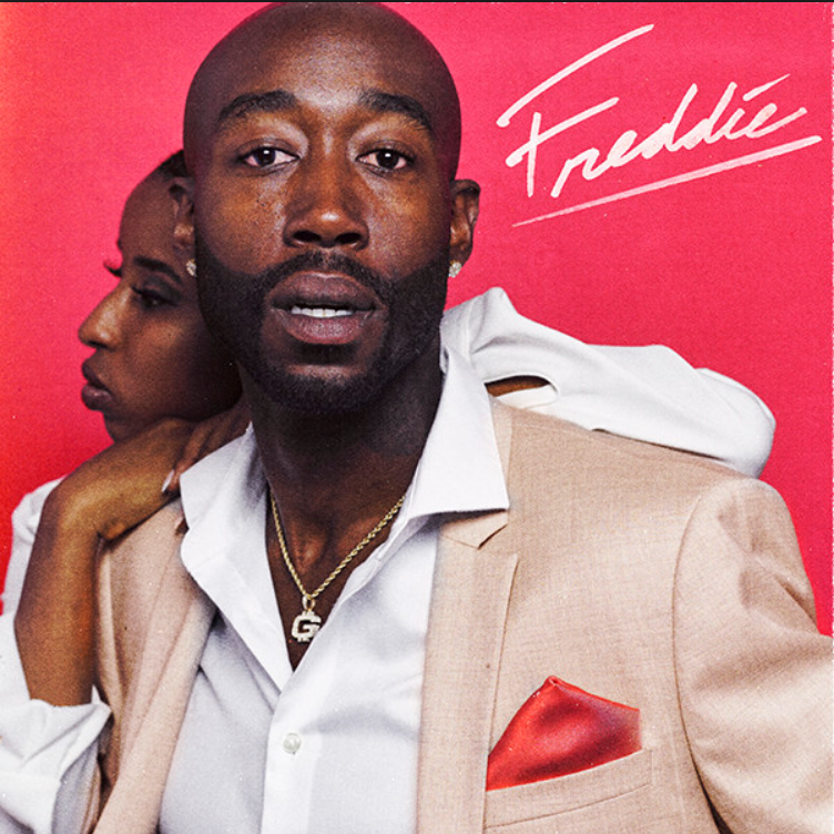
a pinnacle of big flexing cover arts that would make Master P himself shed a tear of approval. The ignorance shown on this cover is only outdone by the actual content on the project. For underground acts the cover art is arguably much more important because they don’t have a name to rely on, the resources to make a quality picture, and often their project is going for free. Even minor notices of detail can make or break an underground artist’s career. Invoking nostalgia with cover arts can be a successful selling point. Any artists can reuse a theme from past cover arts in order to reel in as many listeners as possible. For Freddie Gibb’s “Freddie” cover art he invokes the suave imagery of a soul or R&B singer down to the cursive signature, zesty colored background, and cream suit.
However he never sings on the project and it’s just Gibbs on his bullshit just for the decadence. He didn’t want to throwback to the R&B sound itself, he just wanted to restore the feeling. He went as far as posing exactly like Teddy Pendergrass to promote the album but he really felt like that particular flex. To this day there will never be anything as iconic as the “Parental Advisory Explicit Content” logo plastered over most modern rap cover’s corners. Pervasive on record label’s covers for legal reasons and on mixtapes galore it became an icon for realness. Whether or not an artist chooses to include this logo these days doesn’t matter anymore, especially if the release doesn’t come with a “clean” edited version.

And it doesn’t have to necessarily be in the corner of the cover as Mac Miller proves with “Watching Movies with the Sound Off”, the absurdity of the cover is conveyed with the sound of the project as well. I have plenty of favorite albums whose cover art I dislike and it doesn’t affect my listening. But for the ones that stick I find myself listening to what’s familiar or what I think about first when I’m scrolling through dozens of cover arts. A great cover art can really put you in the mindset for what you’re mindset for what you’re listening to but it’s honestly so much more.


Comments